Mortality Tables and Health Adjustments
Published: 8/8/2025
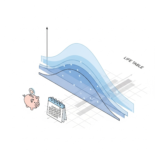
This guide explains how Social Security cohort life tables are used to estimate mortality, how probabilities are transformed into a distribution of death ages for the strategy matrix, and how the optional health adjustment slider modifies those probabilities.
Data Sources
The default mortality inputs come from the U.S. Social Security Administration (SSA) cohort life tables (Alternative 2 / Best Estimate). Source: SSA Office of the Chief Actuary.
Cohort vs. Period Life Tables
- Period tables apply one year’s observed mortality rates to all future ages for a hypothetical person; they freeze longevity improvement.
- Cohort (generation) tables follow an actual birth cohort across time, blending historical experience with projected future mortality improvement.
Because medical and longevity improvements are expected to continue, cohort tables are typically preferred for forward-looking retirement planning. They better reflect expected future survival than static period tables.
Using the SSA Cohort Tables
The tables provide q(x): the probability that someone alive at
exact age x dies before reaching age x+1. For each
recipient we load the cohort file for their birth year and extract the
sequence of q(x) values beginning at their current age.
If gender is left as “Unspecified”, we construct a blended mortality by averaging male and female values:
In words: blended mortality is the simple average of male and female probabilities at each age.
From q(x) to a Death Age Distribution
- Initialize survival probability .
- For each age , compute yearly death probability: .
- Update survival for next age: .
- Repeat until maximum age (cap 120); assign any residual survival probability to the terminal age.
The resulting list of { age, probability } pairs forms
a discrete distribution used to scale the row and column segment sizes in the
strategy matrix. Larger segments correspond to more likely death age ranges.
ProjectionLab
Sponsor

ProjectionLab Sponsor
Already optimizing your Social Security? Take your retirement planning to the next level with ProjectionLab, the comprehensive financial modeling platform trusted by serious planners.
- Monte Carlo simulations: Run thousands of market scenarios using 150+ years of historical data to stress-test your plan.
- Advanced modeling: Model complex strategies including Roth conversions, tax-loss harvesting, and dynamic withdrawal rates.
- Professional-grade analytics: Analyze success probabilities, sequence of returns risk, and optimal asset allocation across market cycles.
Health Adjustment Slider
You can optionally apply a uniform health multiplier between 0.7× and 2.5× to each annual mortality probability before converting to the distribution:
In words: adjusted mortality equals baseline mortality multiplied by the selected health multiplier.
This keeps the relative shape of the mortality curve while shifting overall mortality levels up or down; it assumes your relative difference vs. average persists across ages.
Illustrative impact (approximate): If a 66-year-old baseline cohort life expectancy is ~20 additional years (to age 86), a 0.8× health multiplier might extend that to roughly 21–22 years, while a 1.7× health multiplier could reduce it to roughly 15–16 years. (Illustrative only; actual results depend on full age-specific pattern.)
Interpretation of Multipliers
| Multiplier | Label | Indicative Meaning |
|---|---|---|
| 0.7× | Exceptional Health | Preferred-plus style underwriting class; markedly lower risk. |
| 0.8× | Excellent Health | Clearly better than average risk. |
| 0.9× | Good Health | Moderately better than average. |
| 1.0× | Average Health | Baseline SSA cohort mortality. |
| 1.3× | Fair Health | Elevated risk; some chronic factors. |
| 1.7× | Poor Health | Substantially elevated mortality risk. |
| 2.5× | Very Poor Health | Severe / multiple conditions; substantially elevated risk. |
Note: These adjustments reflect broad population statistics; individual outcomes vary.
Why These Values?
- Medical research: Meta-analysis (DeSalvo et al., 2006) shows ~20% lower mortality for “excellent” vs. average, and ~30% / ~70% higher for “fair” / “poor”; long-term follow-up (Eriksson et al., 2020) shows very poor states can approach ~2×.
- Actuarial practice: Life insurance preferred classes cluster around 70–85% of standard mortality; table ratings escalate to 150–250%+ for impaired risks.
References
- DeSalvo, K.B., et al. (2006). Journal of General Internal Medicine, 21(3), 267–275.
- Eriksson, M., et al. (2020). BMC Geriatrics, 20, 75.
- SSA Office of the Chief Actuary: Cohort Life Tables (Alt 2).